Weaving the club back into Farsley: Designing FC Farsley’s new home kit
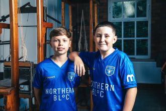
Ed Cowburn writes about designing the new FC Farsley home kit, which is currently used by our Deaf, Development and Women's teams
When Acid FC Creative Director Ed Cowburn was asked to design the inaugural home kit for the FC Farsley women’s team, the brief was deceptively simple — move fast, honour Farsley’s footballing past, and help set the tone for a new era.
What followed was a project rooted as much in place and community as it was in colour palettes and fabric.
A village with its own identity
Farsley occupies a unique position in West Yorkshire. Officially part of the City of Leeds, yet sitting between Leeds and Bradford, it retains a strong village identity — defined by its independent shops, pubs, and industrial heritage.
Cowburn says understanding that “in-between” nature was crucial from the outset.
“Farsley isn’t just a suburb of Leeds — it’s a place with its own character. That distinction really mattered to us when designing the kit.”
While Leeds United dominates the region’s football landscape, Cowburn points out that football in Farsley has been, for decades, the benchmark for non-league football in West Yorkshire.
“Historically, Farsley have always been the club locally. They were the heartbeat. That sense of pride is something we wanted to help reconnect.”
Designing under pressure
The project came together quickly. With only a few days to complete the club branding and kit design before the women’s team began their season, there was little room for experimentation.
For Cowburn, that urgency became a strength.
“The time pressure stripped everything back. There was no room for trends or overthinking — the town had to lead the design.”
The decision was made early to honour the club’s traditional colours — blue, with amber and white detailing — and to reinstate the ram badge, a symbol rooted in Farsley’s wool-trade past and the club’s nickname, The Weavers.
“Once you understand Farsley’s history — the mills, the wool trade, the nickname — weaving isn’t a concept, it’s just reality.”
Weaving history into the fabric
Rather than leaning on literal historical graphics, the shirt incorporates woven pattern elements, inspired by textile structures and arranged in sections like a contemporary camouflage.
“We didn’t want the shirt to feel like a museum piece. The idea was to embed the history into the fabric itself, so it’s felt rather than shouted.”
A key feature of the kit is an illustration of Sunny Bank Mills on the lower rear of the shirt — a site that once produced fabrics for global export and now serves as a major community hub.
“Sunny Bank Mills is where Farsley’s story was physically made. Including it was about acknowledgement, not nostalgia.”
The choice of location carried through to the photoshoot, which took place at the mills themselves, with Lee Browncapturing the imagery under Acid FC’s creative direction.
“To photograph the kit where cloth was once made for the world felt incredibly symbolic. It grounded the whole project.”
A quiet personal connection
There was also a subtle personal link for Cowburn. For a period, his father ran a business on Town Street in Farsley — a connection he didn’t lead with, but one that added weight to the work.
“I didn’t make a thing of it, but knowing my dad had a business on Town Street gave me an extra sense of responsibility. This wasn’t an abstract place — it was somewhere my family had been part of.”
Community before commerce
The project was completed pro bono, reflecting Acid FC’s belief that non-league football clubs play a vital role beyond the pitch.
“Non-league clubs are cultural infrastructure. They’re community glue. This was about helping Farsley feel like it had a football club worth rallying around again.”
Details such as typography were treated with the same intent. The squad numbers use a traditional serif typeface, inspired by the Industrial Revolution era when Farsley’s mills were at their peak.
“Even the numbers needed to feel like they belonged to the town. Every detail carries meaning.”
The kit is manufactured by Uhlsport, a choice Cowburn describes as a natural fit — not least as a subtle nod to David Stockdale’s goalkeeping background.
Goalkeeper kits with local flavour
The goalkeeper kits allowed for a more expressive take on the same storytelling principles. With Northern Bloc joining as shirt sponsor, their packaging became the inspiration for bold diagonal half-and-half designs.
The first stitch
For Cowburn and Acid FC, the kit represents more than a one-off design job. “If players and supporters feel like this kit belongs to them, then we’ve done our job. “This isn’t just a football shirt. It’s an attempt to weave history, community and design back into one fabric.” And, he adds, it’s only the beginning.
“This is just the first stitch.”